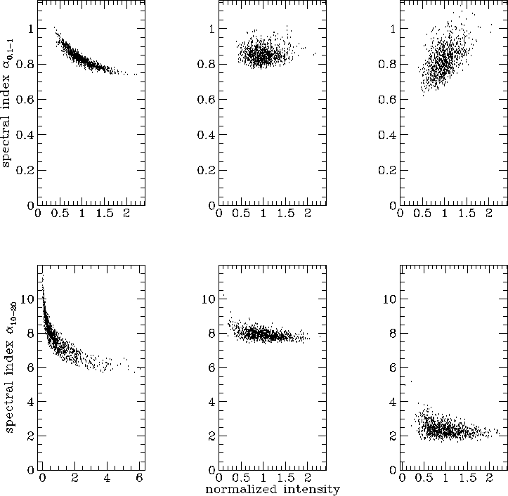
In Fig. 8 I show scatter plots of spectral index against (normalized) intensity for the 3 simulations presented in this paper, for two frequency intervals, one below and one above the break frequency. The spectral index is calculated from two images at different frequencies, while the intensity is that of the lower frequency image of the pair.
Fig 8. Intensity-spectral index scatter plots for the low field,
high diffusion model (left), the intermediate field and diffusion model
(centre) and the high field, low diffusion model (right). The top row
is between the frequencies 0.1 and , while the bottom row is between the
frequencies 10 and 20. The spectral index is calculated between the two
frequencies, and plotted against the intensity in the lower frequency
image, normalized to the mean intensity of the image.
and , while the bottom row is between the
frequencies 10 and 20. The spectral index is calculated between the two
frequencies, and plotted against the intensity in the lower frequency
image, normalized to the mean intensity of the image.
Immediately apparent from Fig. 8 is that the low field, high diffusion model gives a well defined, fairly narrow band of points in the intensity-spectral index plane. For the intermediate model, there is little scatter in spectral index, especially at higher frequency. The high field, low diffusion model gives a much larger scatter in spectral index. While in the intermediate model there is very little dependence of spectral index on pixel intensity, in the other two models at high frequency spectral index is anticorrelated with intensity, so that brighter points have flatter spectra. At frequencies below the break, in the low field case brighter points have flatter spectra, in the high field case brighter points have steeper spectra (because those points are ageing most rapidly), and in the intermediate case there is no strong correlation between intensity and spectral index. In the high field, low diffusion case the sense of the correlation changes with frequency - the bright regions at low frequencies age most rapidly, and if observed at low frequencies will still be bright, but at high frequencies will have aged most and will then be the faintest regions on the image.
___________________________________ Peter Tribble, peter.tribble@gmail.com